Case study
NudeProject
In this master's final project, I explored how to bring fashion, community and shopping together in a mobile experience that people can navigate without losing their way.

- Mobile
- shopping experience design
- Components
- reusable visual language in Figma
- Flows
- connected journeys before development
Collaboration: Academic work carried out as a team; this case study presents the shared proposal.
An unofficial academic proposal for Nude Project. Designed with Figma and Adobe CC; it was neither developed nor released to production. The brand and photographs belong to their respective owners.
The project, layer by layer
Small decisions build the system.
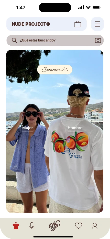
The collection opens the experience; search and navigation remain recognisable.
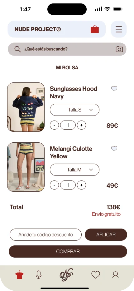
Size, quantity and price are brought into the same decision before proceeding with the purchase.
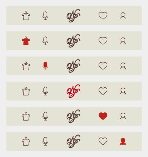
Navigation connects the shop, podcast, brand, favourites and profile through shared components.
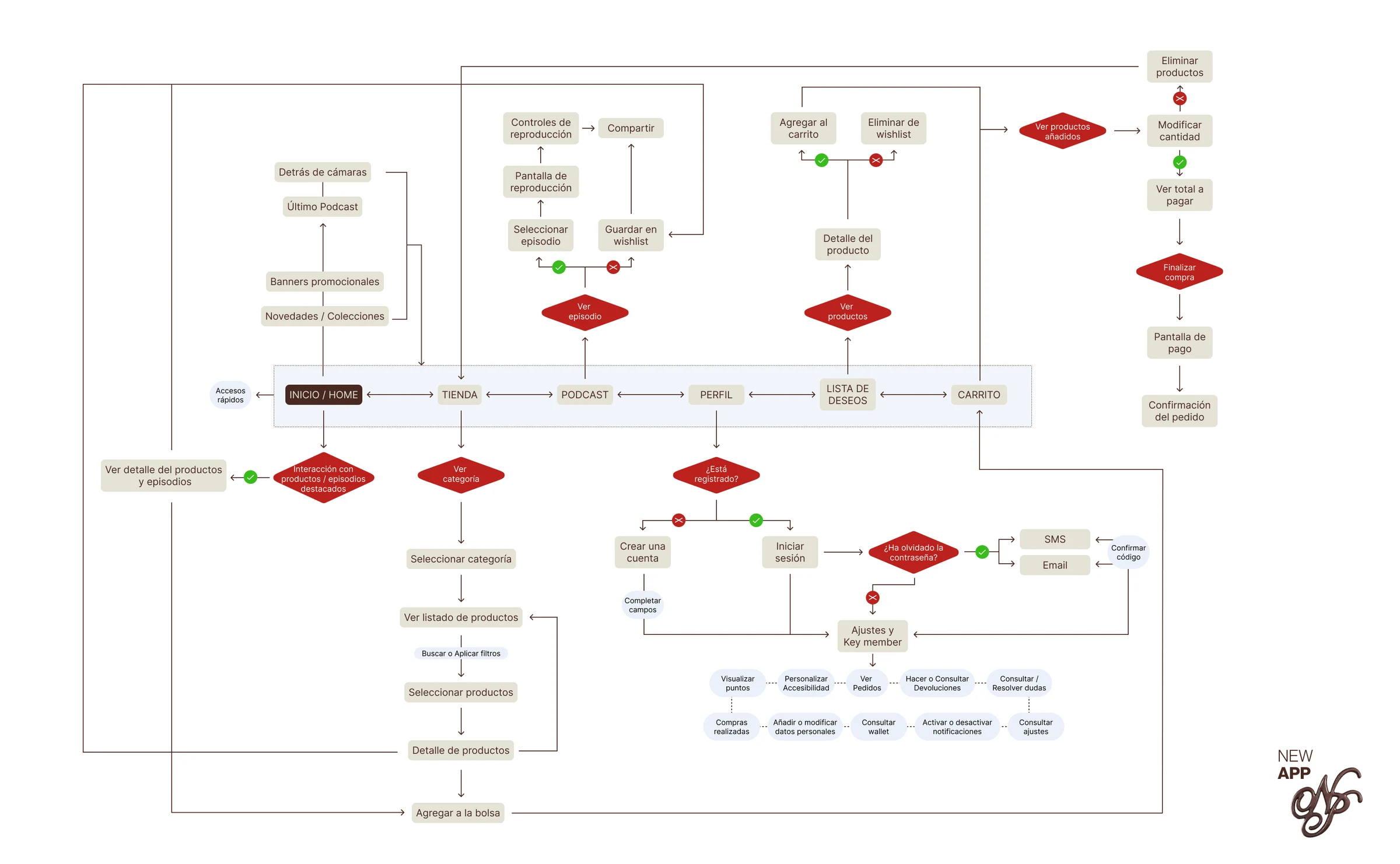
The map makes entry points, decisions and return paths traceable. The expandable original is linked in Figma.
The challenge
I started with a question: how can a fashion brand bring shopping and culture together without treating them as disconnected experiences? With the team, I translated that question into journeys for discovering, saving and buying.
What I show here is academic design: the screens and diagram document the proposed solution, not conversion results or metrics from a real application.
A shared language
I worked with a light palette and brown tones to complement the collection photography. Header, search, cards, sizes and navigation are organised as components and variants in Figma.
The prototype connects the shop, podcast, favourites and profile. The flow diagram let me make purchasing, registration, access recovery and account-management decisions explicit before development.
Prototype, not code
The deliverable was created with Figma and Adobe CC. There was no frontend or backend implementation and no payment integration: the interactions belong to the prototype.
In the shopping bag, I brought together size selection, quantity, discount and total; the bottom navigation keeps the main areas within reach throughout the journey.
Evidence and limits
The original screens, components and flows make it possible to review the proposal's consistency. I do not attribute undocumented user tests or quantified improvements to this case study.
Turning it into a product would require testing accessibility and tasks with people, developing the shop, and integrating inventory, payments and real data. These are future steps, not capabilities that have already been implemented.
From prototype to component
System structure
- Identity / logo
- Header / search
- Navigation / variants
- Product / sizes
- Shopping bag / quantities
- Profile / forms
Evidence
The work, open for review.
The prototype is one part of the process: it documents the system, decisions and flows behind the product.
Explore the screens and components Open the first screen Enlarge the flow diagramLessons learned
I learned that a brand experience needs journeys that are as clear as its visual identity.
Defining components and flows let me review the whole experience before development.
Open question:How can a brand's personality be preserved while simplifying shopping tasks?
Contact
Let's talk.
If you think the way I work would fit your team, or you have a product or research project you would like to develop, I would love to hear about it. Tell me what you need and where you are now. I will read your message personally.
You can also find me on LinkedIn